The over 65s are increasing!
The following chart shows the incredible world population increase since 1871, with the over 65s (depicted in yellow) becoming only noticeable as an age cohort after the medical advances of the post-WWII period.
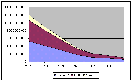
The following chart clearly shows how the under 15s (depicted in blue) are decreasing over time and the over 65s (depicted in yellow) are increasing.


<< Home